E-Wallet App
UX Case study
QUICK SUMMARY
Project Objective: Allow anyone to shop, transfer money, and more without a debit or credit card or the need to visit a physical bank or store.
Context: When I began trying to understand the gap in user needs in the e-wallet space, I discovered that money management does not come naturally to many people. In fact, for most, it is an overwhelming experience.
My Role: UX/UI designer
Design Process: My iterative design process included these key non-linear phases– empathize, define, ideate, prototype and test.
Problems Identified:
Existing e-wallets
Don’t help users stay informed and aware of their spending behaviours.
While their Transaction History feature is a must-have, it does not provide users with the information and data they need to make informed decisions and manage their money better.
Solutions Designed:
Designed an e-wallet mobile app with the below-mentioned features:
Pay a Contact
Savings Goal Calculator and Tracker
Expense Budget Calculator and Tracker
Outcome:
User feedback from usability tests:
“I feel like the app allows me to be more aware of what I am spending on and allows me to build a healthier relationship with money and plan better.”
“I think this app would be very useful to me. I would definitely use this e-wallet app, and I am especially excited about the reports feature.”
“It has all the functionalities I would need. It’s like a combination of payment and personal finance apps.”
“I really like the reports section as it helps me understand what’s happening in a statistical manner.”
“I love the product because I really need a tool like this in my life.”
FULL CASE STUDY
Introducing PlutoPay
When I began trying to understand the gap in user needs in the e-wallet space, I discovered that money management does not come naturally to many people. In fact, for most, it is an overwhelming experience.
While users can use an e-wallet app to make quick and secure payments, they are happy to rely on their banking apps to deliver this need. However, when I asked about their unmet needs, they said it would help if one platform could track their payments across multiple bank accounts and credit/debit cards and keep them informed about their spending behaviours and habits.
When I identified this need, I began designing an app that aims to create a hassle-free payment and money management experience for its users.
What
Native Mobile App
Category
Fintech, Payments
Where
Vancouver, Canada
Role
UX/UI Designer
Design Process
My iterative design process included these key non-linear phases– empathize, define, ideate, prototype and test.
I believe that while these phases are crucial in a design process, the order and frequency of a phase need to be adapted to every project requirement and team.
Project Objective
Allow anyone to shop, transfer money, and more without a debit or credit card or the need to visit a physical bank or store.
Competitor Research
My first step was understanding what other e-wallet apps are currently offering, what user problems they are solving and how.
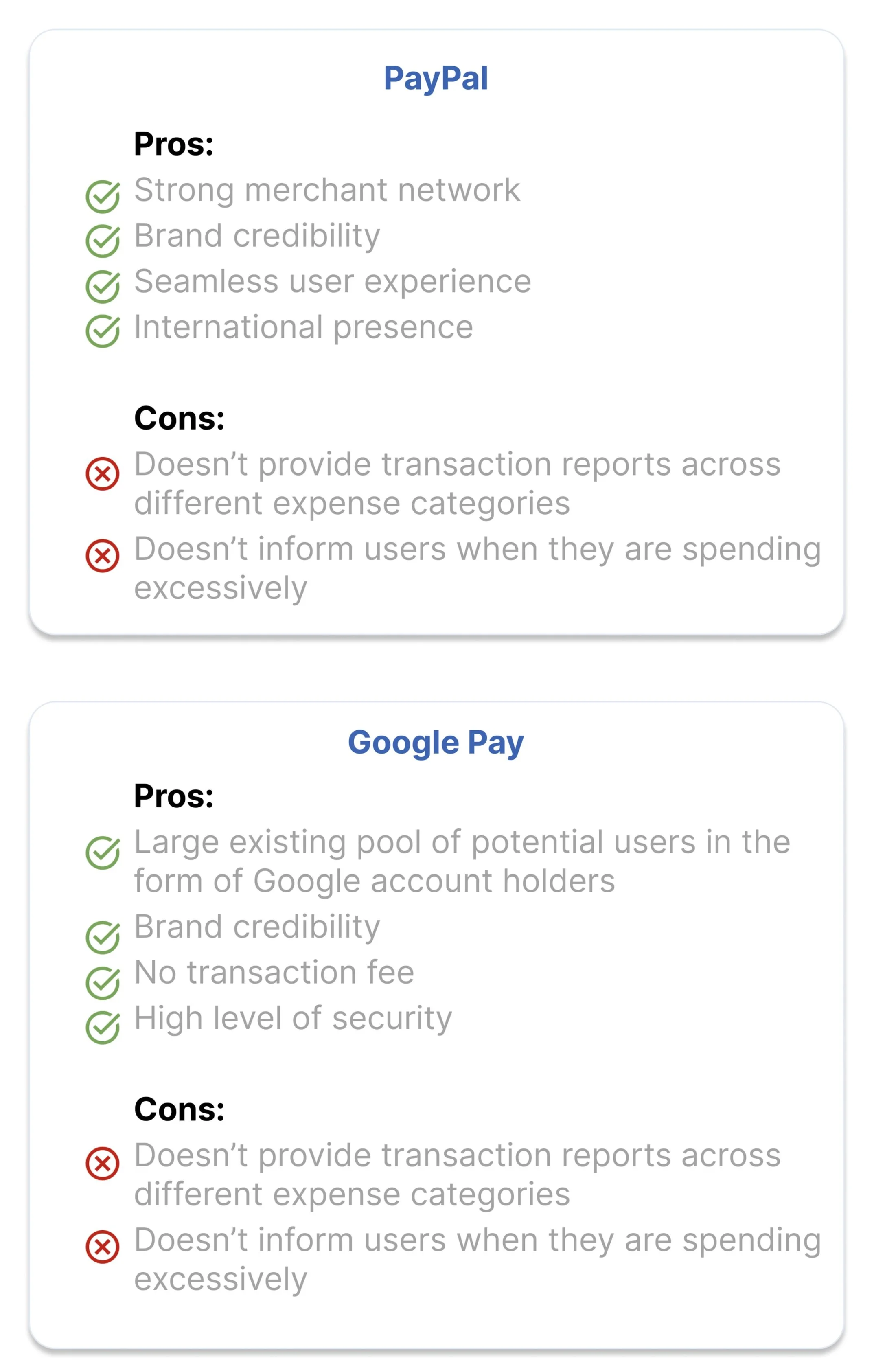
While there are quite a few big players in the e-wallet space, for my research, I focused on the offerings of Google Pay and PayPal.
Here’s what I learned about both:
While they are both great apps that allow users to make quick and secure payments, they don’t help users stay informed and aware of their spending behaviours.
While their Transaction History feature is a must-have, it does not provide users with the information and data they need to make informed decisions and manage their money better.
User Research (User Interviews)
After interviewing 5 prospective users, I learned that:
Research-based Tools
Informed by these insights, I developed tools to lay the foundation for my ideation and design process.
User Personas
AVNEESH
“Savings gives me a sense of freedom and security.”
Age: 31 years old
Occupation: Software Engineer
Location: Vancouver, Canada
Status: Married
Goals & Needs:
Needs to be financially secure
He wants to invest in a house, retirement plan and savings for his future kids
Aims to achieve financial security by efficiently managing his money
Motivations:
Wants to be prepared for all the ups and downs of life
Wants to be financially independent
Wants to live a balanced life
Frustrations:
Is currently lacking a mechanism where he can collate and manage expenses across bank accounts so he can make sound financial decisions
Is seeking regular information that helps him stay within his expense budget for the month
Would love to keep track of his savings so he knows he’s in a good place financially
Daily Activities:
He works in start-up from about 9:00 AM to 7:00 PM
Goes for a run in the evening
Spends his free time doing home chores or watching TV
SEJAL
“I want to be financially independent.”
Age: 24 years old
Occupation: Masters Student
Location: Atlanta, USA
Status: Unmarried
Goals & Needs:
Not exceeding her monthly budget is very important to her
She also wants to save for her trips, build an emergency fund and have some money saved up for her future
Aims to have savings, so she doesn’t need to rely on anyone else to fulfil her lifestyle desires
Motivations:
Wants to travel and see the world
Wants to build a fund that helps her feel secure and independent
Frustrations:
Finds it very hard to stay mindful of her expenses
Finds tracking her expenses and splitting bills to be a very tedious task
Has been struggling to consciously save money as her expenses only seem to be going up each month
Daily Activities:
Attends classes and completes assignments
Likes having a nice cup of coffee every day
Spends her free time going out with friends for movies, dinners, drinks and events
User Stories + User Flows
1.
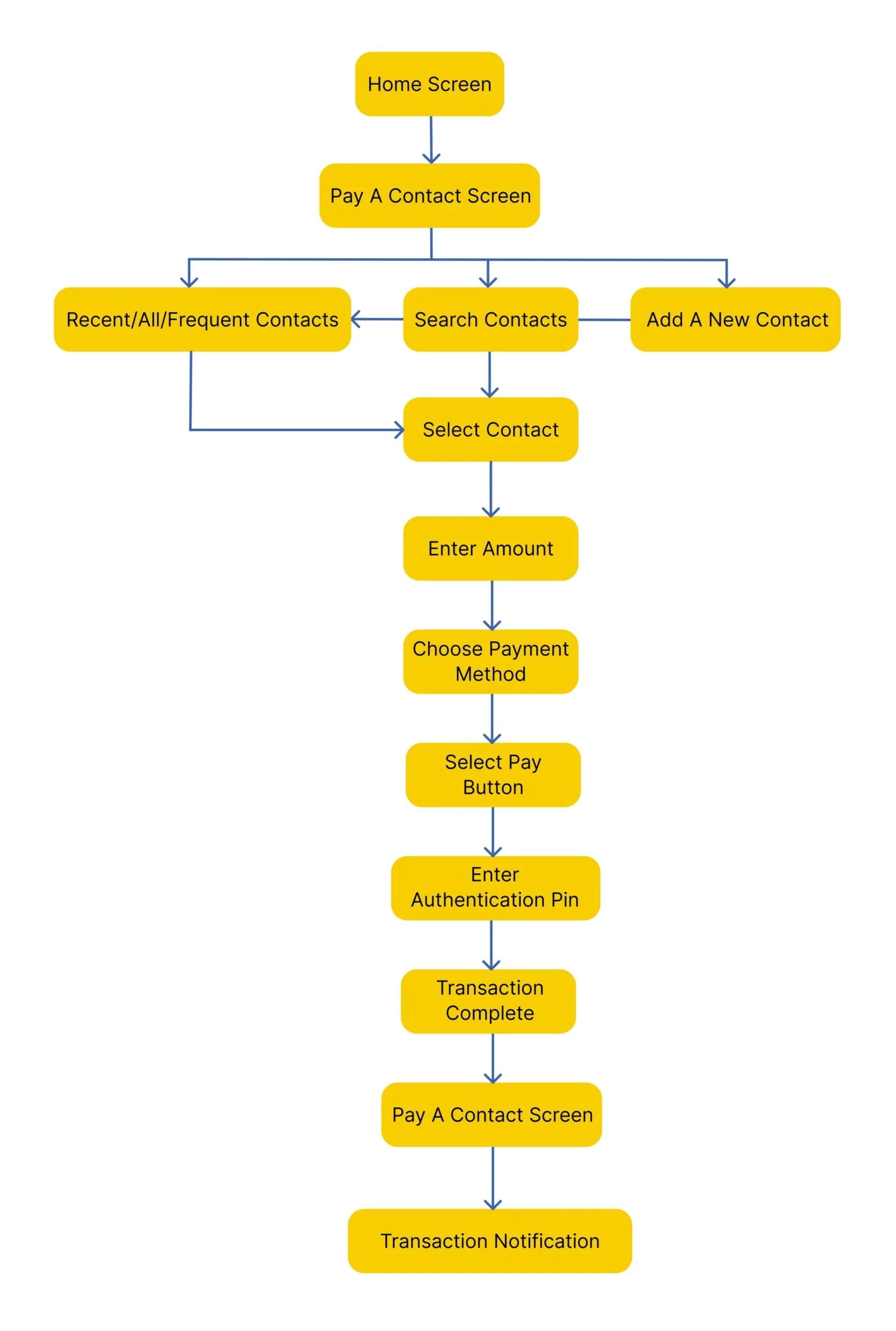
User Story: As a PlutoPay user, Avneesh wants to transfer money to his friend using the PlutoPay app so that PlutoPay can track the expense amount, category with reference to his expense budget
Entry Point: Home screen
Success Criteria: In-app notification about the transaction received
2.
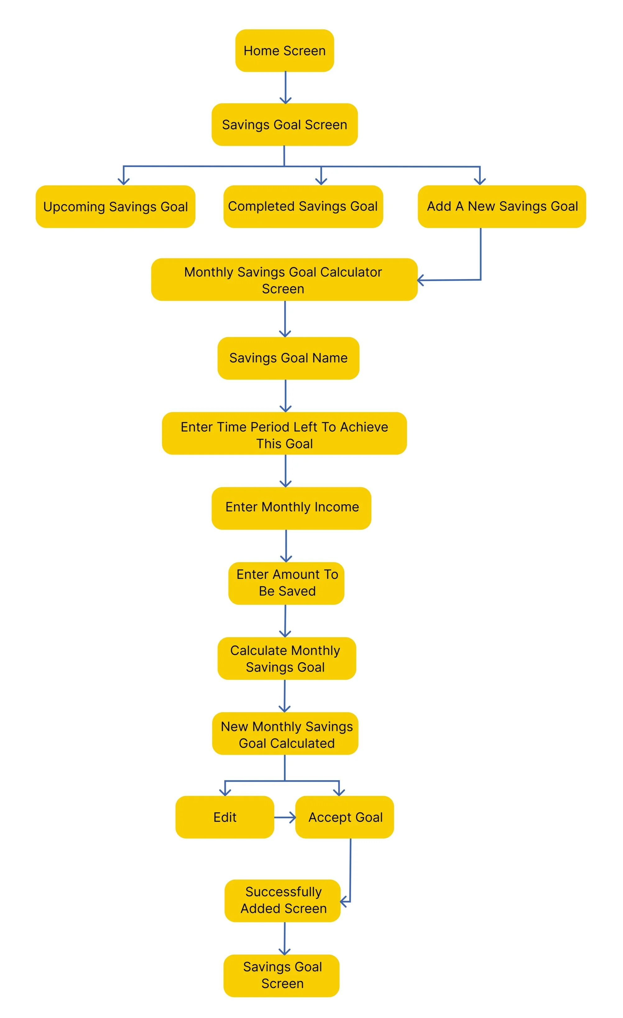
User Story: As a PlutoPay user, Avneesh wants to set up a savings goal for an upcoming trip so that he can save enough money in time for his vacation
Entry Point: Home screen
Success Criteria: Savings goal successfully added
3.
User Story: As a PlutoPay user, Avneesh wants to set up expense budget for the next month, so that PlutoPay can start tracking his budget and expenses for that month
Entry Point: Home screen
Success criteria: Expense budget successfully added
Foundational Design
Once I had my tools in place, I created a basic Sitemap to structure the app's core features.
I then ran a Card Sorting Exercise with 10 participants to determine how prospective users would prefer to club all these features.
The card sorting exercise helped me identify which nomenclatures work best and how users expect to find the information. Empowered by this user feedback, I created a Revised Sitemap.
As PlutoPay is a mobile-first design, I sketched screens of the user flow which then evolved into a mid-fidelity prototype.
In the mid-fidelity prototype, users could use PlutoPay to meet their goals by completing these tasks:
1) Sign Up + Onboarding
2) Pay a Contact
3) Set up a Savings Goal
4) Set up an Expense Budget
Usability Testing
Conducting usability tests in the mid-fidelity stage can save organizations and teams time, money and effort in the long run.
To find any errors or gaps in the mid-fidelity prototype, I conducted 2 moderated in-person and 4 moderated remote usability tests.
Usability Test Goal
This study aims to observe and measure if users understand the app, find it useful, and can easily identify how to make payments and track and monitor their expenses and savings.
Usability Test Objectives
Do users understand what the app is about quickly and easily?
Can they sign up and set up the PlutoPay account easily? Is this process overwhelming? If yes, why?
Observe if they can quickly and easily navigate, understand, and complete all the tasks.
Do they feel more informed about their spending behaviour and more in control?
In order to make the most out of my test findings, I began by collecting all the information using digital sticky notes and then used the Rainbow Spreadsheet to organize this information.
Based on the business goals, frequency and severity of the problem, I rated the errors using Jakob Nielsen’s four-step rating scale.
Backed by this analysis, I identified the top 5 issues that required immediate attention.
Top 5 Usability Issues
Usability Test Conclusion
All users understood the main value proposition of the app
They were able to sign up smoothly. A couple of queries came to their mind along the way, which can be solved with better UX copy
The users were able to complete all the tasks. However, they didn’t fully understand certain wordings or nomenclatures used, which can again be resolved with improved UX writing
In terms of the questions they had regarding the features, we need to improve the experience by offering optimal design solutions
Preference Test Conclusion
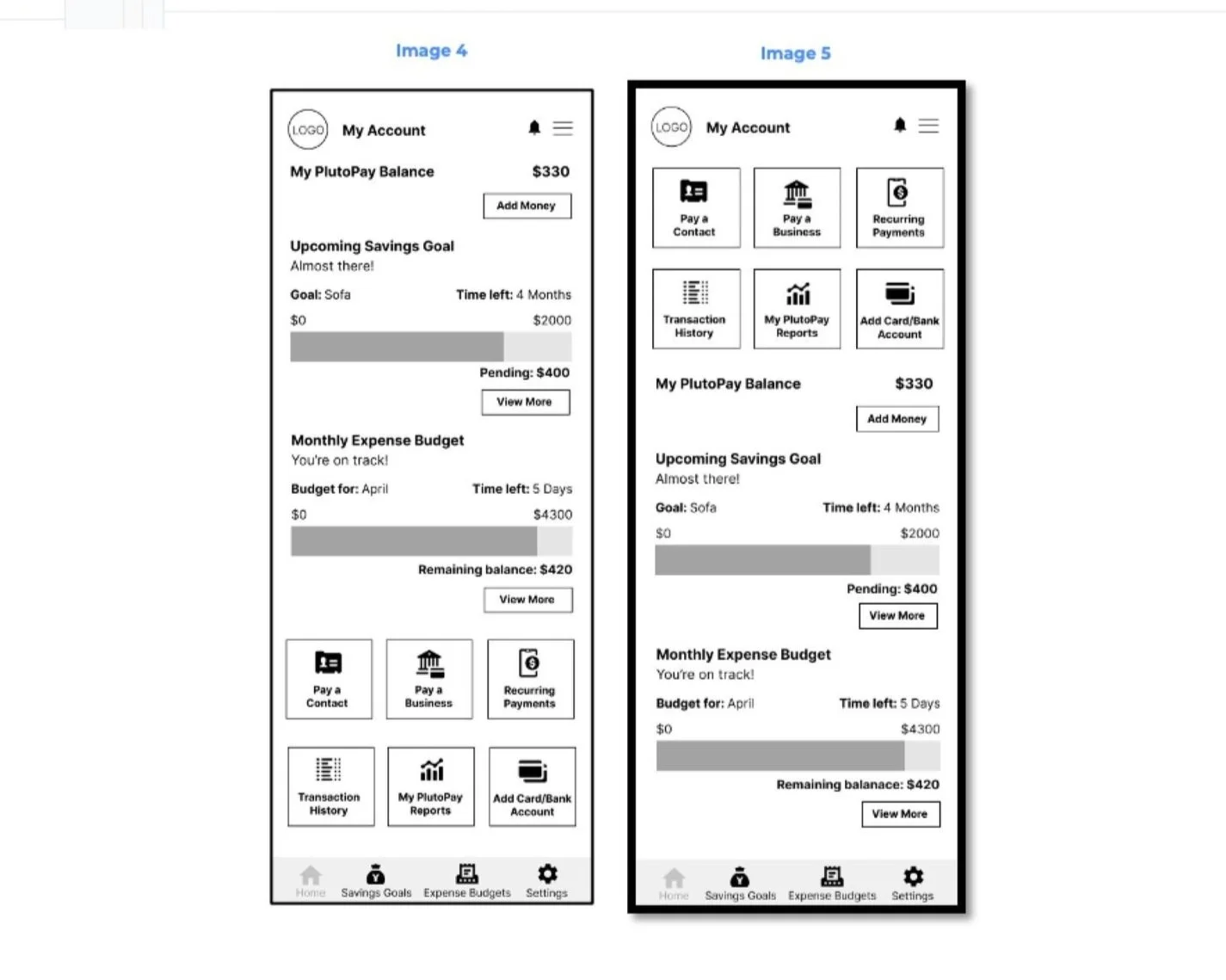
With mixed feedback on the order in which the users would like information to be presented, I conducted a Preference Test using the Usability Hub tool to identify the ideal layout for the Home screen.
And I had a clear winner - Image 5.
With all this quantitative and qualitative data to back my understanding of how I can improve the app to meet users' needs, I moved on to the Visual Design stage in my design process.
Visual Design Documentation
01. Colour Palette
During user research, I discovered that my users didn’t feel very confident in their ability to manage money and felt like they had a tough time trusting e-wallet apps.
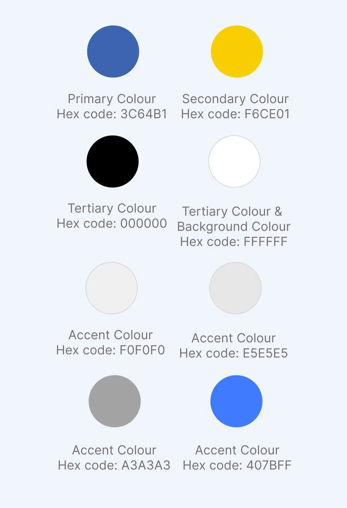
Keeping this in mind, I chose these colours for my app and here’s why:
Blue: Invokes a feeling of trust and security
Yellow: Invokes confidence and optimism
Black: Invokes emotional safety
White: Represents cleanness and efficiency
Grey: A neutral colour to be used sparingly
02. Typography
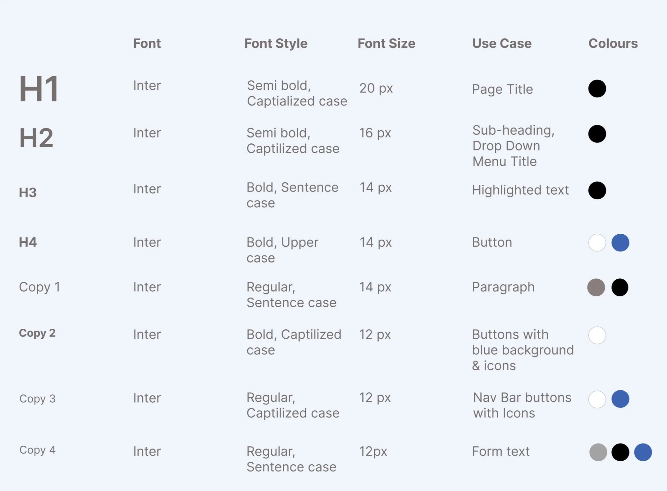
To improve the readability of the content in my app, I chose to add a hierarchy to the text using different colours, font sizes and styles.
03. Icons
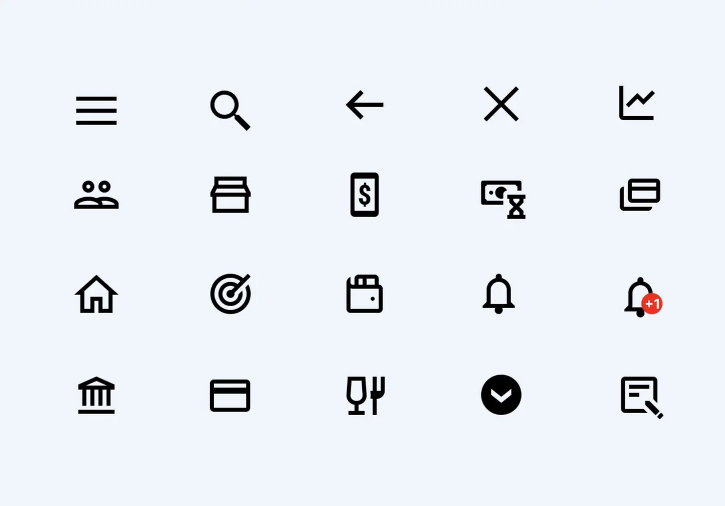
To ensure the icons are visible, the icon size across the app is 24 px x 24 px.
All icons are sourced from Icons8. To improve accessibility, I have used as many universal icons as possible.
To make the icons more visible, the colour changes depending on the background it is placed on. For example, blue icons are to be placed on a white background, black icons on a yellow background and white icons on a blue background.
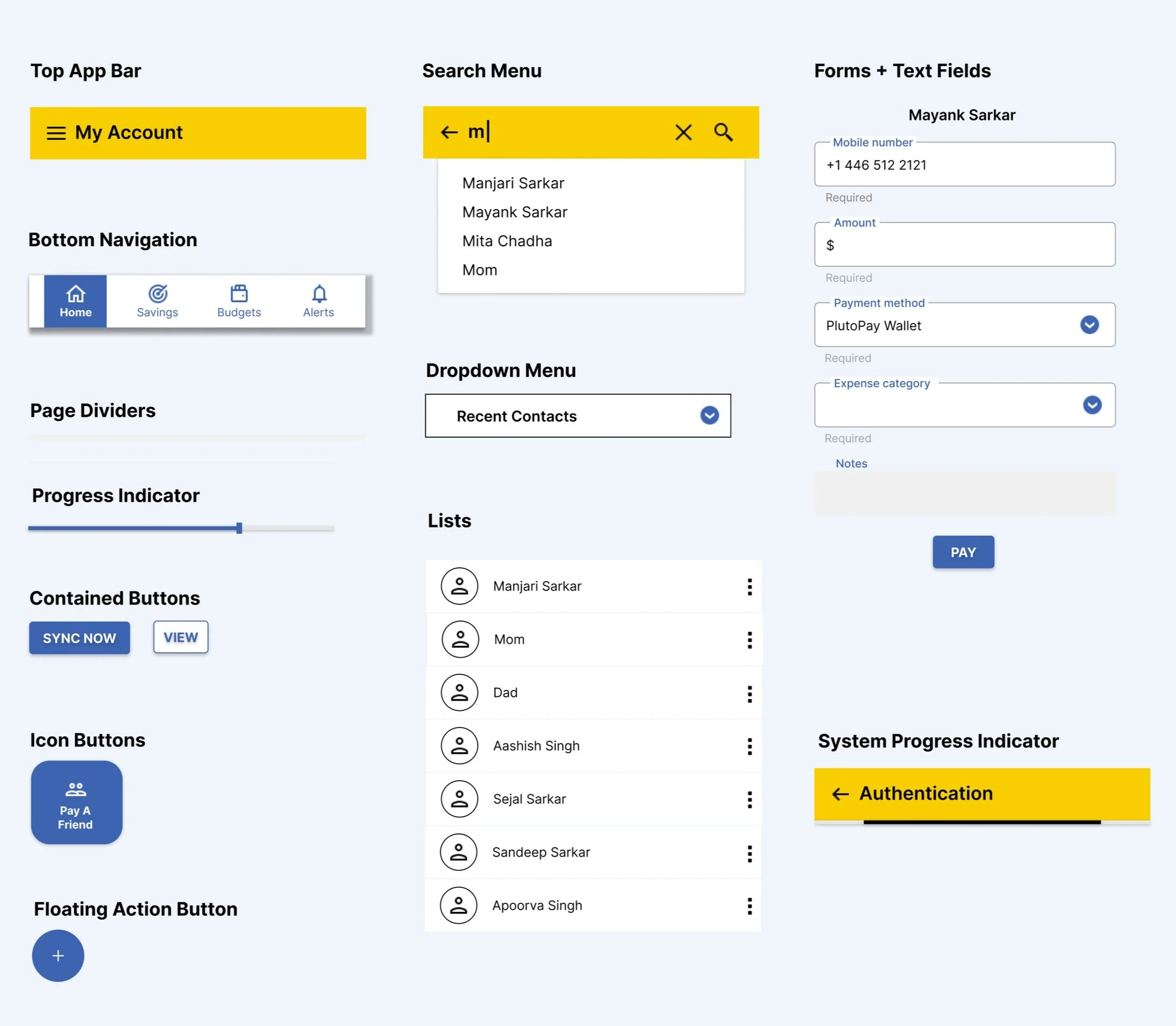
04. Common UI Elements
05. Language and Tone of Voice
As per user research, users usually feel overwhelmed and under-confident when managing their money. With this app, I wanted to help make money management easier for users while also making them feel confident in their ability to manage their expenses and savings.
Dos
The tone of voice should be positive and encouraging.
The call-to-actions must be clear and specific and create a sense of urgency so that users feel encouraged to plan and track their expenses and savings so they can meet their money management needs.
The overall language must be simple, direct and easy to understand.
Don’ts
Sound intimidating or cause worry
Use complicated terms
Use lengthy text
06. Illustrations
The primary goal of using illustrations is to compliment the text to help users feel a sense of confidence and achievement.
Dos
Used to reassure users about their actions and must help them feel rewarded so they can look forward to repeating these actions
Must be as close to the brand colour palette as possible (as we are currently using free illustrations)
Don’ts
Use illustrations that don’t include any brand colours
Delay the user
07. Animations
The primary goal of using animation is to focus on being efficient and help users feel a sense of achievement, whether it may involve completing a task or a goal within the app.
Dos
Used to reassure users about their actions and must help them feel rewarded so they can look forward to repeating these actions
Short and snappy
Under 1 second (exceptions to be made for loading screens)
Don’ts
Delay the user
Use exaggerated animations
High-fidelity Prototype
Based on extensive user research, feedback and observations from usability testing, I designed the new and improved version of PlutoPay.
Like all things in the UX space, this, too, is a work in progress.
What’s Next
I am going to work on the high-fidelity version of the Reports feature next. And here are all the amazing things the usability test participants had to say about the reporting section of PlutoPay.
“I feel like the app allows me to be more aware of what I am spending on and allows me to build a healthier relationship with money and plan better.”
“I think this app would be very useful to me. I would definitely use this e-wallet app, and I am especially excited about the reports feature.”
“It has all the functionalities I would need. It’s like a combination of payment and personal finance apps.”
“I really like the reports section as it helps me understand what’s happening in a statistical manner.”
“I love the product because I really need a tool like this in my life.”
Key Learnings
Steering away from leading questions allows user research to shed light on the unmet needs of users
A non-linear design process saves teams time, money and resources in the long-run
User experience can always be improved with new features or improvements to existing features
To build inclusive products, it is important to ensure your research participants belong to diverse cultures and backgrounds
Selecting an odd number of participants for testing/research leads to a more accurate sense of user preferences/need
Thank You
It means a lot that you made the time to go through my work. I would love to hear your thoughts. Please feel free to get in touch with me through the Contact page. Cheers!


