Fitness App
UI Case Study
QUICK SUMMARY
Project Objective: Motivate people into an exercise routine that suits their level, schedule, and interests.
Context: According to research, people struggle with their busy routines to make time for regular exercise, impacting their overall quality of life.
My Role: I am the UI Designer on this project- Workout Goals, where I was tasked to design a responsive web app.
Design Process:
Selecting top user stories
Mapping the user flow
Low-fidelity designs
Mid-fidelity designs
Creating a moodboard
Creating a style guide
Prototypes
Responsive mockups
Problems Identified:
Users need the motivation to commit to exercise routines
Users struggle to find exercise routines that they enjoy, fit their schedule and match their fitness levels
Solution Designed:
Designed a workout app with the below-mentioned features:
Workout Stats for Motivation through recognition
Advanced Search based on User Needs
Personalized Feed to improve discoverability
Multiple User Accounts for Motivation through community
Routine Schedular
Key Learnings:
The lesser decisions a user needs to make at a time, the better it is
It is equally important to focus on how easy you can make decision-making for a user than focusing solely on reducing the number of clicks a user needs to make to complete a task within the app
Error messages must always be highlighted with colour and text for improved user experience
The mobile-first approach allows one to easily scale up a design for multiple breakpoints. It also allows me, as a designer, to assess which content is essential on a screen for a user to complete a task. This process of elimination helps me build clutter-free designs across multiple screen sizes
FULL CASE STUDY
Project Context
Keeping up with everyday things is extremely challenging in a world where time flies.
Between doing a great job at work, completing chores, taking care of kids (if you know, you know), spending quality time with family, sometimes we feel lucky if we find the time to shower, eat healthy food and get at least seven hours of sleep.
And, of course, exercise tends to take a backseat. Sometimes we don’t know where to start. Other times we don’t know how to get back.
If only making time for exercise in our daily routines didn’t have to be so difficult.
My Role
I received the brief to design a fitness app for my course with Career Foundry.
I am the UI Designer on this project- Workout Goals, where I was tasked to design a responsive web app.
Inspired by my everyday apps like Netflix, Spotify and Calm, I set out to design a fitness app that is not only intuitive but modern and minimalistic.
With the thought process that my users need to make fewer decisions at a given time, I set out to design a fitness app that solves specific problems users face today.
The Objective
Motivate people into an exercise routine that suits their level, schedule, and interests.
User Persona
MEET REBECCA
“I love the thought of having something that could really work with my schedule. Being as busy as I am, makes it tough to exercise otherwise.”
Job Title: Software Developer
Goals:
Rebecca wants to lose weight and get in shape, as her sedentary job doesn’t allow a lot of time for exercising
To help with this goal, Rebecca wants to find a tool that will help her fit exercise routines into her busy schedule
As a beginner to working out, Rebecca also wants something that will help her learn how to properly exercise
Rebecca wants help finding routines she can enjoy
Tasks:
Rebecca wants to be able to find exercises that match her goals of losing weight and getting in shape
In addition, she wants to find short exercises that she can do multiple times per day in between other activities
She wants the tool to keep her motivated as well, as her schedule can often be distracting
Environment:
Physical: Rebecca lives in an apartment with her boyfriend and 3-year-old daughter
Social: She has several friends from her software development job, and one of them recommended this tool as something she should check out to help her reach her goals
Technological: Rebecca is very tech savvy, as she works on computers every day
Ideating The Solution
The two most important things I set out to achieve:
Motivate users with stats regarding their progress
Make it as easy as possible to find exercise routines that they enjoy, fit their schedule and match their fitness levels
Step 1: Selecting Top User Stories
As a new user, I want to learn about different exercises so that I can figure out what is best for me.
As a new user, I want to be shown how the exercises are done so that I know I’m doing them correctly.
As a frequent user, I want to be able to schedule exercises for working out so that I build positive habits.
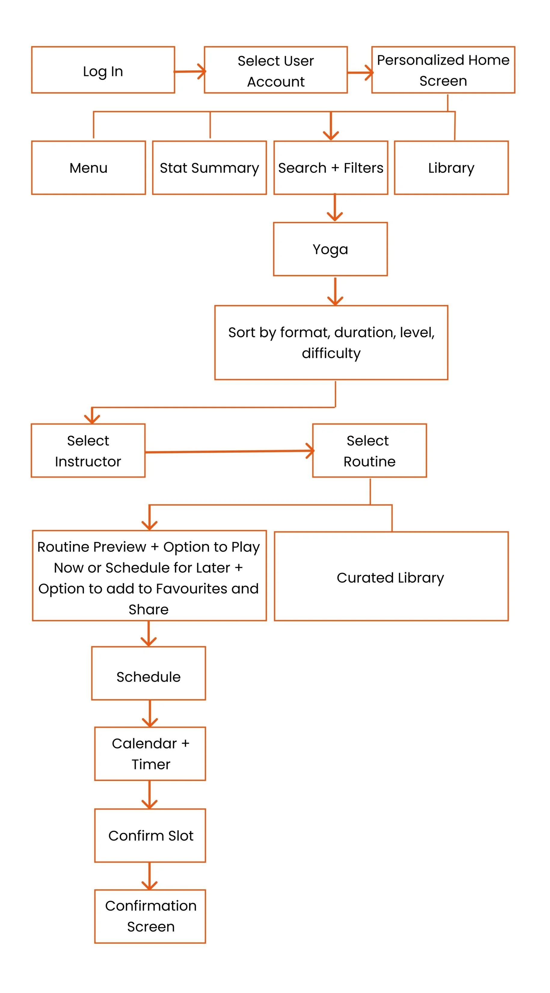
Step 2: Mapping The User Flow
The next was to identify how users can complete these tasks using the Workout Goals app.
Tool: FigmaStep 3: Designing Low-fidelity Designs
Using the mobile-first approach, I designed low-fidelity mobile screens to define what each screen needs to include in order to be able to complete all the steps in the user flow.
The core thought behind this process was - how can I help people stay motivated while also making it easy for them to find a fitness routine that works best for them?
Tool: InVisionStep 4: Designing Mid-fidelity Designs
While my low-fidelity designs included all the nice-to-have information and features, this stage was about defining the visual hierarchy and spacing for the content and elements.
Tool: FigmaThe Visual Design Journey
Step 5: Creating A Moodboard
Colours have the power to influence our mood, so it became crucial to select colours that help create the right mood for users. As per the project brief, black and orange were the brand colours. So here’s how I chose the colour scheme for the app.
Capturing the gist of the project brief, I established the emotions I wanted the app to evoke.
With the knowledge of my primary colours and the emotions I seek to evoke, I created two moodboards.
I then conducted a quick user test with 5 participants to identify which moodboard would work best. I came to the conclusion that Moodboard 2 was doing a much better job of evoking the desired emotions.
“This visual makes me feel like I need to get physically active right now.”
When asked which words they would use to describe this moodboard, they responded using these adjectives:
Step 6: Creating a Style Guide
01. Logo
For black or dark tinted backgrounds. The background may be solid or a dark-tinted image
For white backgrounds. The background should be solid
For orange or backgrounds in other colours. The background may be solid or a dark-tinted image
02. Colour Palette
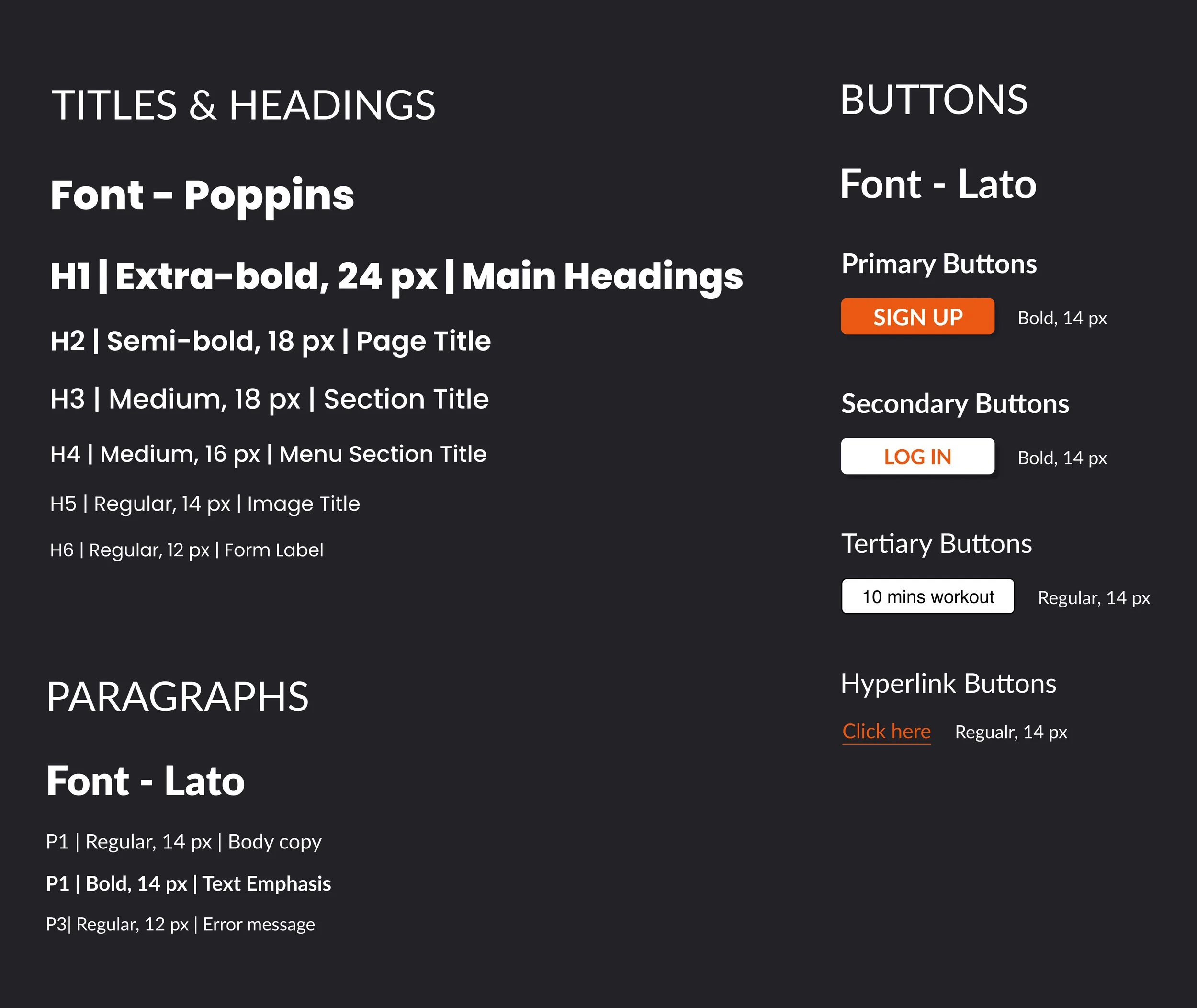
03. Typography
04. Icons
05. Imagery
DOs
Minimalistic, bright/white backgrounds to help bring attention to the subject in the picture
Image setting needs to be indoors/residential as most of our users are seeking workout videos that require easy to no-setup at all
Each subject must highlight an emotion or action to evoke the required emotions in users
The subject must be the main focus of the image or video because when it comes to exercise videos, people relate to people
With images, they should be zoomed in on the main subject and maintain a balance of intense and easy-going images
The images must represent the diversity of our users so that users feel represented and can find relatable content
An image may be used as a background on screens/pages that have minimal text, e.g., splash screen, login screen, sign-up screen etc.
DON’Ts
Use images of equipment as users will relate more to people than objects
Use images of outdoor exercises as most users will primarily conduct their workouts indoors
Use images with dark backgrounds or darker tones as it doesn't go well with the brand's mood
Use images that do not include the face or head of the subject as they do not evoke any emotion; thus, they will not drive much engagement
06. Gesture for Mobile
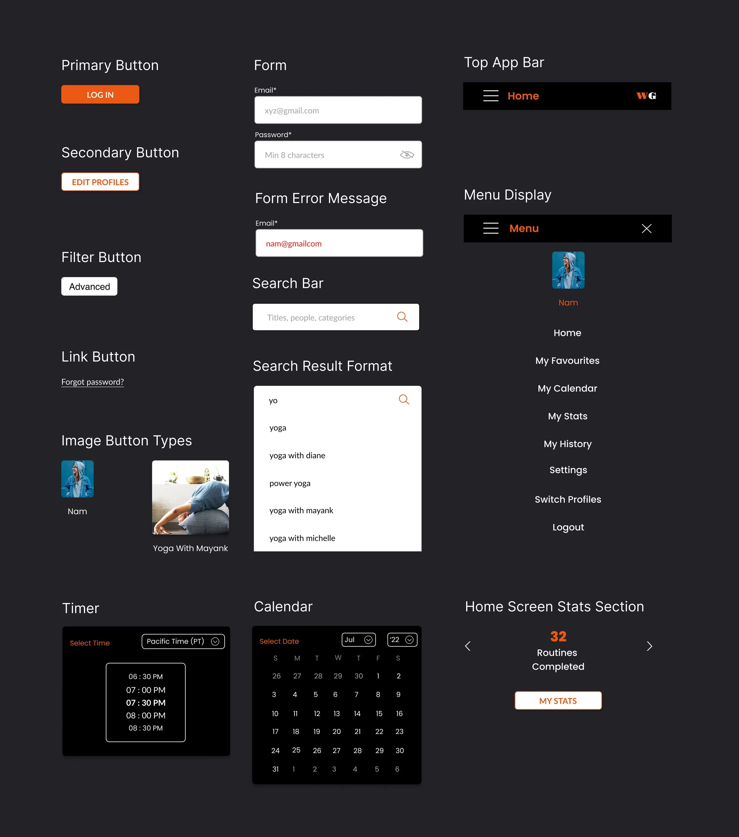
07. UI Elements For Mobile
Mobile Mockups
Tool: RotatoTest the prototype here.
Responsive Mockups
Tool: RotatoMy Key Learnings
The lesser decisions a user needs to make at a time, the better it is
It is equally important to focus on how easy you can make decision-making for a user than focusing solely on reducing the number of clicks a user needs to make to complete a task within the app
Error messages must always be highlighted with colour and text for improved user experience
The mobile-first approach allows one to easily scale up a design for multiple breakpoints. It also allows me, as a designer, to assess which content is essential on a screen for a user to complete a task. This process of elimination helps me build clutter-free designs across multiple screen sizes
Thank You
Thank you so much for taking the time to go through my work. I hope you enjoyed viewing my work as much as I loved designing it.
Yours sincerely,
Namraata


